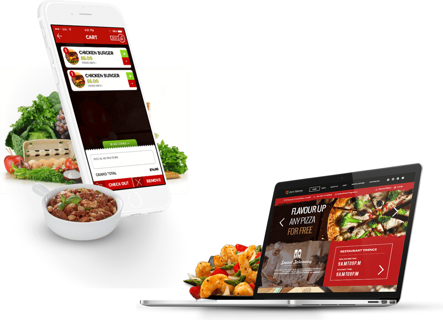
Smart Takeaway
Smart takeaway is an online food ordering service providing SaaS solutions to retailers who are under the burden of third party service providers. Major focus of business is to make the direct connection between the vendor and the end user. For this purpose Smart Takeaway is providing mobile application and website to restaurant owners so that they could have their own identity in the market and can make that direct connection with their customers.
Project Sector:
eCommerce, Food
MY ROLE:
Lead UX/UI, Web Designer
PROJECT TIMELINE:
4 Weeks
PROJECT SCOPE:
Rebrand complete mobile app, design a web layout and convert into HTML/CSS
PROBLEM:
Before joining, Smart Takeaway was already in the market with their mobile application (but not with the website). In order to know where exactly the problem was I arranged an internal meeting with the CEO and Sales people and asked them some series of questions like:
-
Business Situation:
How many customers have we lost?
-
Consistency:
How many are our old customers?
-
Feedback:
What is the feedback of the old customers who left?
-
Goal:
Is the end user completing the goal smoothly?
-
Design:
Is the end user (customer ordering food) happy with the app and how it operates?
-
Functionality of the product:
Is the retailer getting orders smoothly without any technical bugs?
After the meetings I requested the Stakeholder to arrange a meeting with the customers so I could talk directly to them and get as much insight as possible regarding the reason why they left.
It turned out the problem was in every aspect of the application. The application
was buggy, the calculations were not performing correctly, the design was
difficult to interact with, there was no consistency in the design.
DESIGN PROCESS
MARKET ANALYSIS:
At that time there was no company who was following the business model like Smart Takeaway, although there were other companies like Hungry House, Fill My Belly, and Just Eat etc. whose targeted market was the same as Smart Takeaway. The major difference was that they were operating as a single market place for all the restaurant owners although Smart Takeaway wanted to give owners their own presence so that they could make that direct connection with their customers. The creation of competitive profiles (in terms of marketing strategy, target market, core business, usability, layout, navigation structure, compatibility, content, design and performance) together with SWOT analysis helped to assess current offers in this area.
Opportunities:
OPPORTUNITY #1
-
OWN MOBILE AND WEB APP:
We had an advantage over our competitors as they were serving the market through the single marketplace application, but smart takeaway was handing over a complete package with their own mobile app, website and admin panel.
OPPORTUNITY #2
-
LOWER RATES:
Our competitors were charging huge amounts of commissions from the restaurant owners. Just Eat take 14% (+VAT) PLUS a 50p admin charge. So it was an opportunity for us to get in the market with an affordable solution.
OPPORTUNITY #3
-
BUSINESS MODEL:
Since our competitors were already in the market with their single marketplace platforms, we wanted to give the restaurant owners that could help them create their own presence online.
OPPORTUNITY #4
-
BUGGY APP:
As we already had some of the clients operating on this platform so we had to be very careful with the changes that we were doing. A little mistake and customers would end the subscription of the product. So there was a huge responsibility on the design as well as development team to make sure nothing goes wrong.
Challenges:
CHALLENGE #1
-
PRODUCT WAS IN THE MARKET:
The product was already in the market which means that we had a very short deadline to pull this off. The room for playing around with things was very little. There were a lot of technical constraints involved. So we had to work very carefully and had to make very wise choices.
CHALLENGE #2
-
BUGGY APP:
As we already had some of the clients operating on this platform so we had to be very careful with the changes that we were doing. A little mistake and customers would end the subscription of the product. So there was a huge responsibility on the design as well as development team to make sure nothing goes wrong.
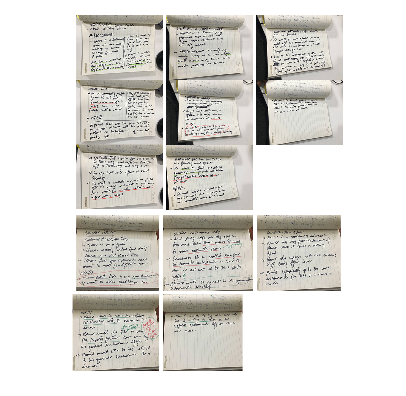
KNOWING THE AUDIENCE:
Knowing the audience for this product was very important. Keeping in mind that we were catering a business model i.e. B2B2C so we had to create personas according to that. For this purpose personas for both restaurant owners and end customers were created to analyze their needs.
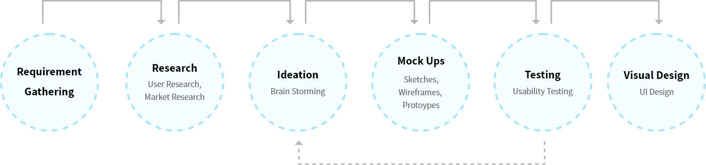
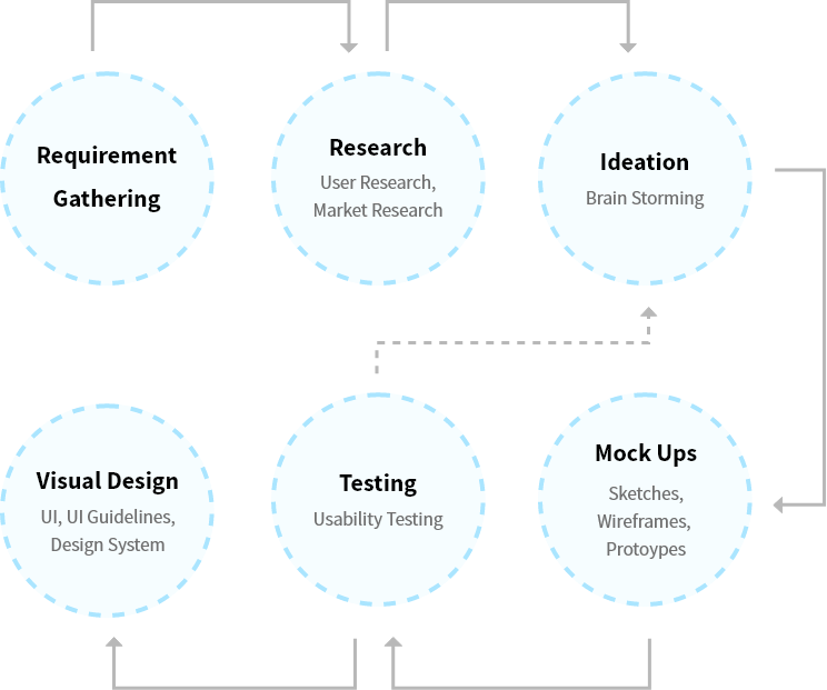
BUILDING THE STRUCTURE:
After the process of finding problem and testing the issues of previous application I had now enough data to start working on the User Flow, Journey and Rapid Prototyping (rough sketches).
I led the discussion with developers to make sure I get everybody’s opinion on what we were doing and how the flow should be, what to add and what to skip (Keeping the Race-Against-Time constraint in mind).
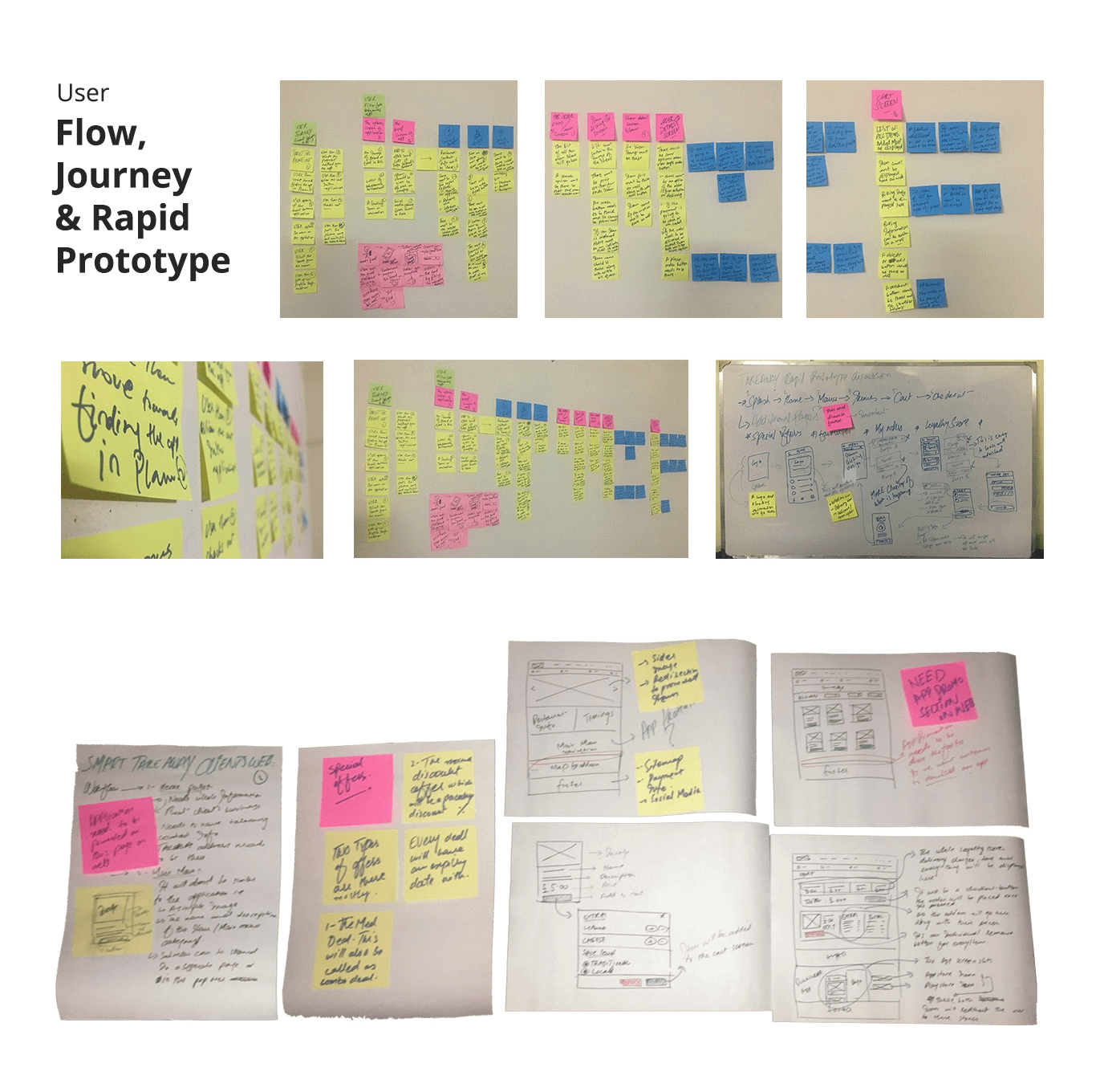
Due to the time shortage we had to run the Usability test cycle with stakeholders to get the feedback on the design layouts. There weren’t much huge changes that were asked although I got some feedback and incorporated it directly into the visual design phase in order to save the time.
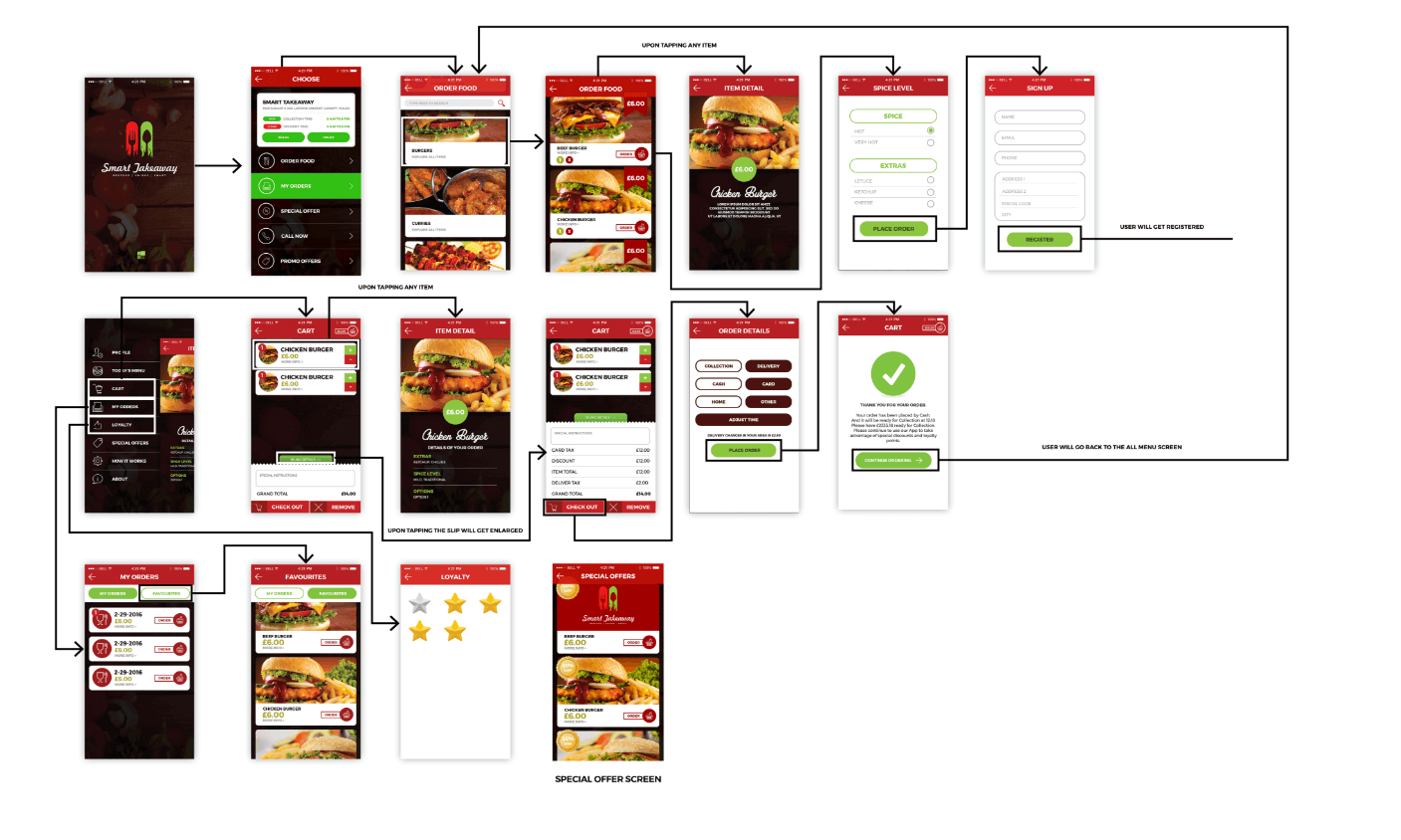
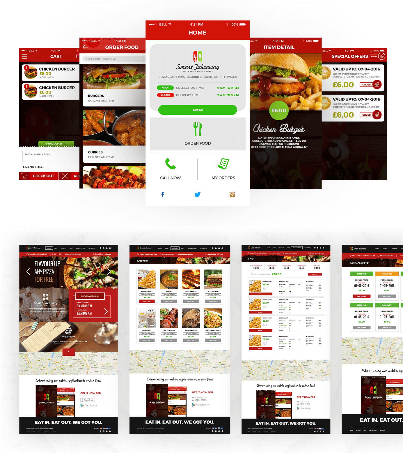
VISUAL DESIGN:
Due to the immense struggle of team we made it to the Visual Design phase flawlessly. The response from the stakeholders was amazing.
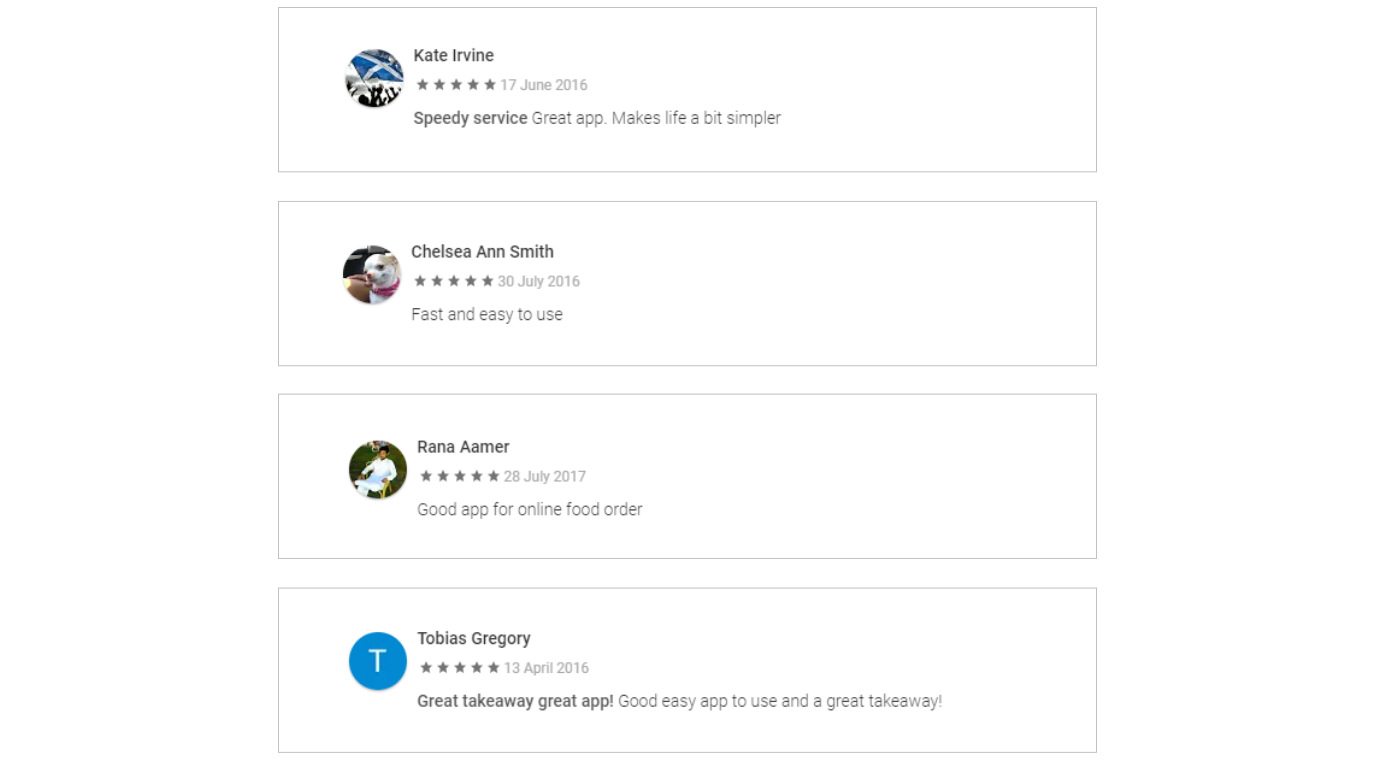
FEEDBACK FROM END USERS:
CONCLUSION & LEARNING:
Due to the flawless collaboration, there were hardly any revisions required, neither in journey mapping stage nor in visual design.
As a learning: Make sure to really take the requirement from the customer right, and I truly mean RIGHT. A simple mistake can result in the destruction of business. Another thing is to communicate, as a designer its our duty to keep everyone in the loop so everyone stays on the same page and that's where the true team work come in.
if there was more time, I would have then worked a bit more on the visual side of the design and website. Tested the site map in bit more detail, but nonetheless within the given time frame both the app and web resulted in a very fruitful response both from Restaurant owners as well as from end users.
NEXT PROJECT:
GP Checklist
UX/UI - Product Design, HTML CSS